Posts

Showing posts from September, 2017
Image
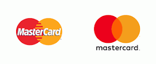
warm This logo uses the warm colors of red, yellow, and orange. I think the company probably chose these colors because the bright colors stand out.  This logo uses the warm colors of red, yellow, and orange. I think the company probably chose these colors because the bright colors stand out. analogous This logo uses the analogous colors of dark-blue, light-blue and blue. I think the company probably chose these colors because the company wants you to feel cool. This logo uses the analogous colors of dark-green, green, and yellow-green. I think the company probably chose these colors because green stands for nature and they are a nature green . primary This logo uses the primary colors of red, yellow, and white. I think the company probably chose these colors because this company wanted to make there product Stan out. This logo uses the primary colors of yellow, orange, and blue. I think the company probably chose these colors because this company wanted

typography blog

Image
What we learned We learned how to use the Adobe Illustrator tools to make a our name and then label the different parts of the letters. We learned how to us the line tool. We also learned how to copy an image in Adobe Illustrator. How it went The typography project wasn't that hard, but it wasn't that easy either. The typography project went well. The typography project was hard because we had to label all of the parts of the letters. What I would change What would change would change would put a picture up of the typography we were supposed to do. I would do the directions in which they were said in a different order. I would change the way in which it was directed.
Image
What the project was. In e-comm we learned how to use Adobe Illustrator and a couple of it's tool. In Adobe Illustrator  we made we made a color wheel. The project wasn't that bad or that hard. Making the color wheel was a lot of fun. What I learned I learned about the color theory. I learned that the primary colors are red, yellow, and blue. The secondary colors are orange, purple, and green. The tertiary colors are red-orange, yellow-orange, yellow-green, blue-green, blue-violet, red-violet. I also learned how to use the eclipse tool, the artboard tool, how to copy an object. How it went The color wheel project went well. If there was something that I would change it would be how it would be how I did it. What else I would want to learn is how to use the rest of Adobe Illustrators. The rest of the Adobe Illustrator's tools.