The project
Recently we have been learning about frame animations in Photo shop. We were then tasked with making an animation where a ball bounces, and the rest was up to us. The process What I learned
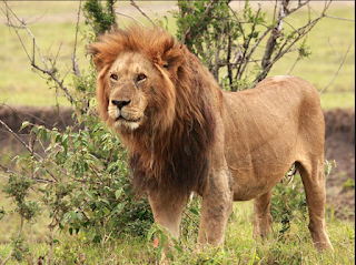
Summary of project The summary of this project was to see if you were a lion which symbolizes strength, courage, and leadership. The otter which symbolizes joy, curiosity, and friendship. The beaver which symbolizes a diligent preserver and a protecter. The Golden Retriever symbolizes loyal. What I learned I learned that I am a lion which stands for leadership. I like to be in charge at most times for example, if I am cooking I like to be the head chef. Wrap it up Over all the project was very insightful about who you were and you'r personality
What the project was The project was to make a video that incorporated rolls, crawls, or hops. Just to make it interesting. Then we had to go back to the room and edit it. Then after we edited it we had to submit it on Google Classroom. What I learned I learned that making a video can take a long time. With a lot of redoes just to get it correct. Then with the editing we had to get it down to 1 minute. Especially when I had to go through every video and pick the best one. Wrap it up Over all I think the project was good. Because We had a good director it went smoothly. It took about 10 retries to get it right.
Scope of the project The idea of this project was to make the ten words that we picked out that described ourselves into a video. The process Our first step was to type the 10 words into photo shop. What did I learn What I would do different What I would keep the same What experiences will you draw from to enhance your next project General thoughts


Comments
Post a Comment